Interface studies
How do you assess an online casino’s desktop interface?
A practical worksheet for examining navigation, labels, zoom and recovery paths on a desktop casino site, without confusing polish with usability.
Choose a task that does not require a wager
A casino website can fill a large monitor with colour and still leave a simple question hard to answer. Where are the game rules? Which balance is being shown? How does the visitor close a layer without losing their place? This worksheet treats those questions as design problems that can be observed. It does not score operators or report tests we have not performed.
Start with a public, non-transactional task: find a help page, identify a game description or locate the route to account support. Do not create an account, provide personal details or place a bet merely to complete the exercise. If the information sits behind an account barrier, record that boundary. A useful study can end with an unanswered question, provided it shows exactly where the evidence ran out.
Draw the route before judging the styling
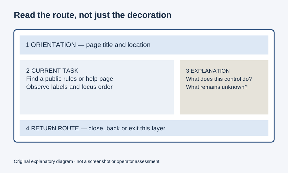
Our diagram divides a hypothetical desktop interface into four regions: orientation, the current task, contextual explanation and a route back. These are analytical labels, not a prescribed page layout. A real site may organise them differently. Sketch the visible regions on paper and write the label a newcomer would use for each. Then compare those words with the labels the interface actually provides.
For example, a symbol might look like an information control, but its destination may be a promotion. Record the visible label and the destination separately. If several paths lead to similar-looking panels, note whether the panel heading tells you which one is open. This establishes a baseline for a more precise observation: whether a person can maintain a sense of location as the page changes.
Follow the keyboard focus
W3C's explanation of Focus Visible describes why a person using the keyboard needs to see which element will receive the next action. Apply that principle to the chosen public task. Put the pointer aside, move through the page with the keyboard and record the sequence of visible controls. A border appearing somewhere is useful only if you can identify the actual focused control.
Do not activate a deposit or play control as part of this exercise. Stop before any financial action. If focus disappears into a carousel or embedded area, note the last recognisable element and whether you can return. This is an observation about one route at one time. It is not proof that the entire service either meets or fails accessibility requirements. A full assessment requires a broader method and appropriate expertise.
Sources: W3C: Focus Visible.
Separate a label from a placeholder
W3C's forms guidance explains the need for labels that identify controls and are associated with them. For a desktop casino interface, useful inspection points include search, filters and non-sensitive help forms. A faint prompt inside a box may disappear when typing begins; a persistent label can continue to explain what the field is for.
Record the wording before and after entering harmless example text in a public search field. Do not put personal, payment or account information into a test. Check whether the label names the actual operation: searching for a game title is different from searching the support centre. Our design question is whether the surrounding page makes that difference legible. A clear label prevents a mistaken expectation before a result or error has to correct it.
Sources: W3C: labelling form controls.
Enlarge the page and observe what changes
The W3C Reflow explanation addresses reading enlarged content without unnecessary movement in two dimensions. It also recognises that some material, including certain games and diagrams, depends on a two-dimensional arrangement. That exception is not a reason to assume every part of a casino page must behave like a fixed game board.
Enlarge the public help page or narrow the browser window. Observe the prose, menu and close controls separately from any game area. Does ordinary explanatory text wrap? Does a fixed banner cover the paragraph you are trying to read? Can a panel still be dismissed? Write down the browser, approximate viewport and zoom setting with the observation. A cropped screenshot alone cannot tell a later reader which combination produced the layout.
Sources: W3C: Reflow.
Inspect the recovery path
A good route includes a way back from a mistake. W3C's Error Identification explanation says that an automatically detected input error needs to be identified and described in text. An empty search result is not necessarily an input error under that criterion. Our broader design question is whether harmless interactions explain their outcome: when a search has no results, does the interface say what happened and offer a comprehensible next step?
Consider two hypothetical messages. “No games match this title; try another spelling” describes a result and a possible action. An unexplained red border leaves the visitor to infer both. Neither example reports an actual operator's behaviour. When recording a real interface, quote only the short message needed to document the issue and distinguish it from your suggested revision. A proposed improvement should never be presented as text already supplied by the site.
Sources: W3C: Error Identification.
Use the worksheet without manufacturing a score
The worksheet has three possible observations for each question: shown, not shown on this route, and not checked. These categories deliberately do not become a percentage or a star rating. A missing observation can result from an account boundary, unavailable page or unfinished task. Combining those circumstances into a quality score would conceal information rather than summarise it.
Add the context in your own notes: public help page, desktop browser, date, and the exact task attempted. Our widget keeps choices only while the page is open and produces a short coverage statement. It makes no request to an operator and stores no session record. A reader can use the same questions with an interface of their choice, but each conclusion still needs its own visible evidence.
Record only what you checked. No overall score is calculated, and nothing is saved.
Connect usability to explanation, not persuasion
Within its scope, the Gambling Commission's RTS 3 requires game rules to be readily available before a customer commits to gamble. That gives this design study a concrete British context: the route to an explanation matters, not simply the presence of a rules document somewhere on a server.
Our concluding observation should name one specific relationship. For example: the game card identifies the title, but the public route examined did not reveal the version's rules. That is more useful than declaring the whole site confusing. Separate the visual hierarchy, the available information and the action required to reach it. The result is a design record another person can repeat, question and improve, without mistaking attractive presentation for evidence about fairness or encouraging anyone to gamble to finish an inspection.
Sources: RTS 3: rules and likelihood of winning.
Questions answered
Can I assess a casino interface without placing a bet?
You can inspect public navigation, help, labels and available explanations without placing a wager. Record account barriers as limitations instead of creating an account or making a transaction just to finish a test.
Does this worksheet certify accessibility?
No. It records a few observations on a defined route. A full accessibility assessment requires a broader method, appropriate expertise and evidence across the relevant service.